Campaigns
Marketing - POS Materials - Digital Assets

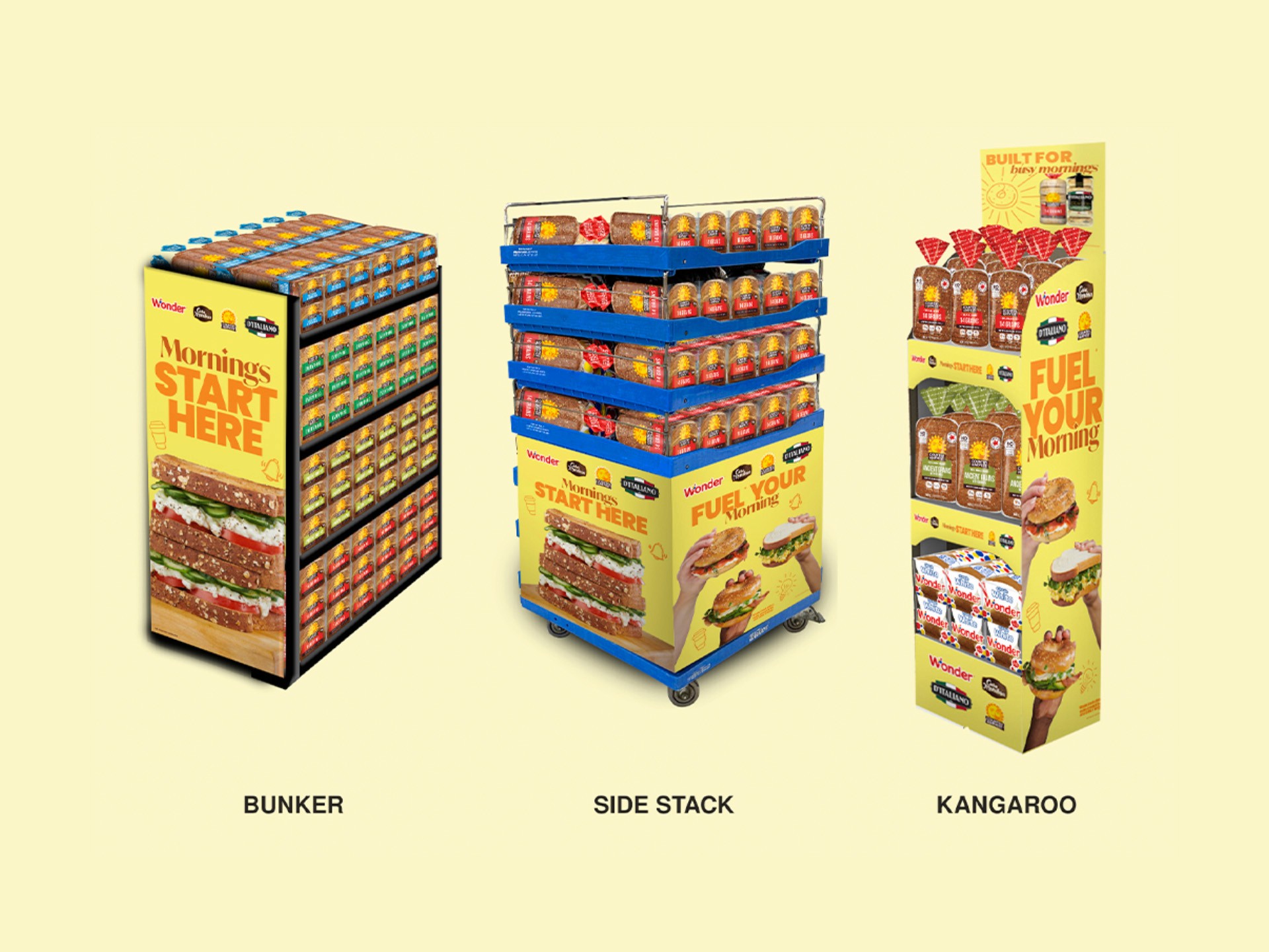
Wonderbrands' sales team relies on dedicated shopper marketing programs to secure incremental display space at retail. However, from mid-September to mid-April, the brand had no unified program in place. Previous years filled this gap with single-brand campaigns - a short-term fix that created inconsistency between programs and offered little flexibility in which brands received display space.
Client:
Wonderbrands
Role:
Lead Designer
Year:
2025
POS Artworks - 1st Concept & Final Artwork


Explore the full story -
Challenge
The brief called for a two-phased, multi-brand, multi-category shopper marketing program spanning Breakfast - one that felt visually unified across both phases while allowing key creative elements, such as header cards, to be efficiently updated between them. Phase 1 (Oct 1 – Dec 31) needed to capture convenience shoppers and open-choice buyers, who represent 68% of bagel buyers. Phase 2 (Jan 1 – Apr 1) needed to shift focus to the protein portfolio, highlighting protein breads, English muffins, tortillas, and bagels.
Objective
Rather than designing two separate creative systems for each phase, I set out to build one flexible concept that could carry through both phases with minimal rework - solving the brief's core challenge of unity plus adaptability, while giving the sales team a consistent, cohesive display presence for the full six-month window.
Results
The concept was selected by the brand team with minimal revisions needed - feedback was limited to small adjustments like font and copy line changes. My initial design featured a two-color corrugate POS structure: one side in a warm orange-yellow, tying into the sunny, breakfast-morning feel for the bagel side of the campaign, and the other side in a cooler blue tone, chosen to visually differentiate and highlight the protein portfolio. After reviewing with the marketing team, we simplified the direction to a single orange-yellow palette across both sides, differentiating the two sections instead through imagery - using different product photography on each side rather than color-blocking. Once the design was approved, I prepared pre-production files ahead of the photoshoot, which featured our own in-house products. The final production result stayed remarkably close to the original concept, with very few changes carried through from initial design to execution. The campaign was produced in both English and French, and rolled out to retail locations across Canada.

Digital Portion of the Campaign: Loblaws Ads

